Whether you're cruising down the aisles of the grocery store, or speeding down the freeway, you're guaranteed to come across a few famous logos. Take one glance at any one of these logos and you instantly recognize the brand, but did you know there's sometimes a hidden message buried in them? It's surprising, but true.
Here are 30 famous logos that have a hidden message. Take a look: Note: I acknowledge that some aren't "hidden" but are simply products of smart designing. The word "hidden" is used loosely here.
Baskin Robbins
Take a look at what's highlighted in pink. Look familiar?
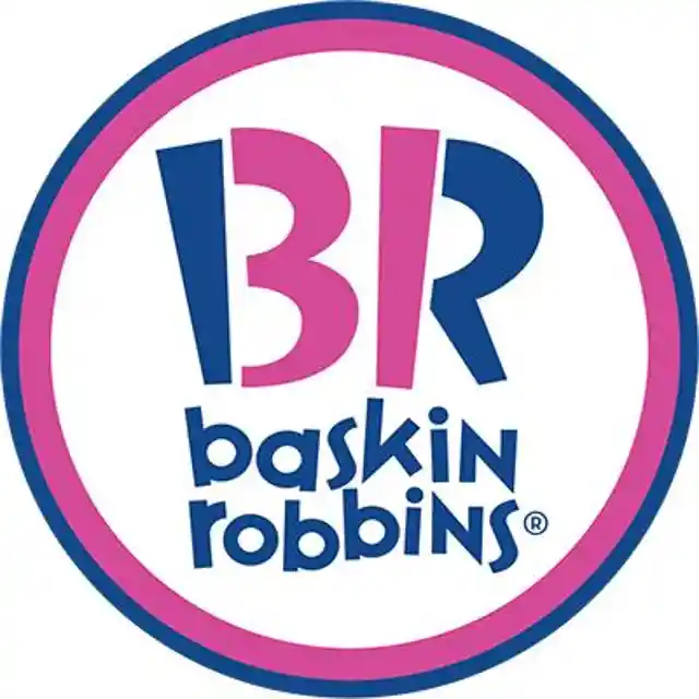
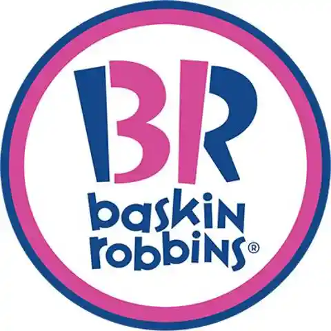
It's a 31, which is the number of flavors they offer. This is definitely a witty way to lowkey show that fact!
Tostitos
The two middle T's in Tostitos shows two friends sharing some tortilla chips and salsa.

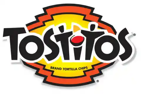
Just a great way of telling people that their products are better when shared.
Amazon
Your initial thought when looking at the Amazon logo might be that the arrow looks like a smiley face, meaning Amazon is there to make its customers happy.
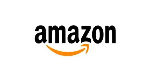
Well, notice that the arrow is pointing from the a to the z; representing the fact that Amazon provides a variety of items for sale, literally from A to Z.
Hope for African Children Initiative
When you first look at it, it looks like only a map of Africa.
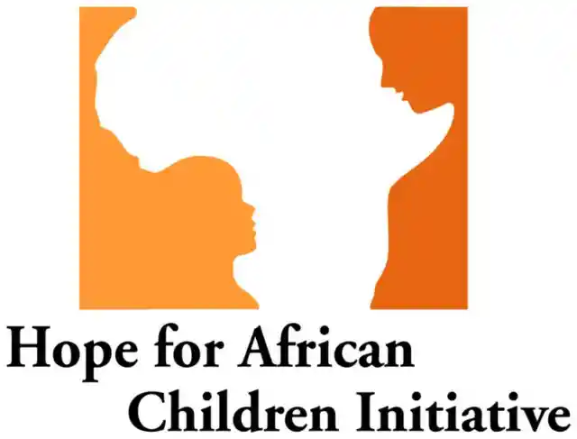

But take a closer look and you'll see an adult and child facing each other.
Toblerone
Notice Anything?

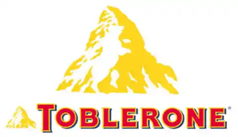
To always remember where they came from, Toblerone shows the bear from the mountains and depicts the city of Bern in Switzerland or the City of Bears.
Sun Microsystems
Usually boring tech companies stick with boring, meaningless logos, but not Sun Microsystems.
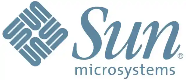

Take a closer look at that diamond and you'll see it actually says Sun in every direction.
Spartan Golf Club
This logo is pure genius. Look at it one way and you see a Spartan helmet.
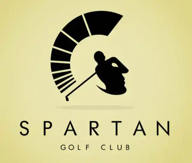

Look at it another way and there's a golfer taking a swing.
Pepsi
In 2008, Pepsi spent $1 million to pay Arnell Associates to come up with the new logo (the old is the on the left and the new on the right). As a result, Pepsi had to pay millions more to re-brand everything. Then Arnell's document was leaked and it was entitled, "Breathtaking Design Strategy." It proposes that the new logo is some kind of Da Vinci Code.
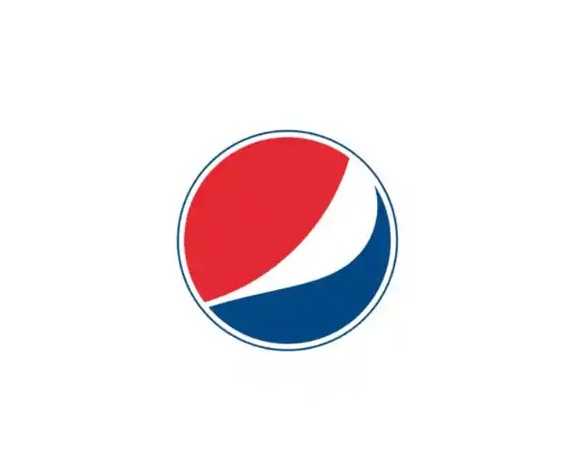

According to Arnell's document, the Pepsi logo draws on Feng shui, the Renaissance, the Earth's Geodynamo, the theory of relativity, the universe, and more. For more, read it over at Gawker. There you have it: the Pepsi logo is the key to the universe.
IBM
IBM’s logo has a hidden message for the whole world hidden in the Big Blue logo that represents it’s company.
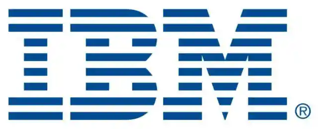
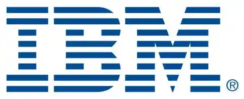
The white lines passing through give the appearance of the equal sign in the lower right corner, representing equality.
McDonald's
Yes, it really means "M" for McDonald's and there really isn't any other meaning McDonald's had intended. Instead, it came to mean something unintentionally by customers, at least according to design consultant and psychologist Louis Cheskin. In the '60s, McDonald's wanted to change their logo but Cheskin insisted on leaving the golden arches.

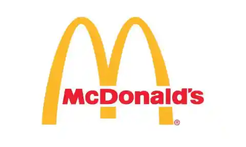
He said it's because customers unconsciously recognize the logo as "symbolism of a pair of nourishing breasts" (via BBC). Whether we unconsciously believe this or not, Cheskin convinced them and now the logo is one of the most recognizable in the world.
Toyota
The three ellipses that are found in the logo for Toyota represent three hearts: the heart of the customer, the heart of the product, and the heart of progress in the field of technology.
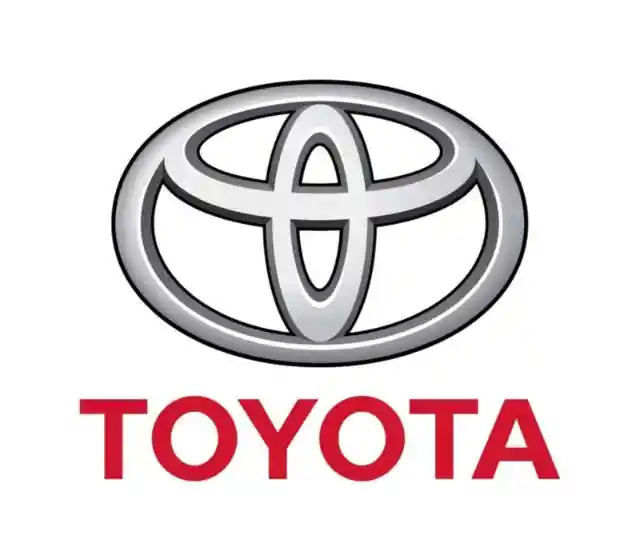
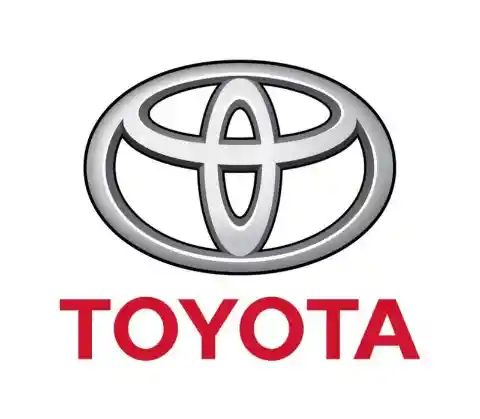
But everyone knows that by now.
BMW
As long as I can remember, the BMW logo has been associated with a blue sky and a propeller spinning, going back to its aircraft-building days. But what if I told you that wasn't the original intention? According to NYTimes, the trademark was registered in 1917, but the propeller association wasn't created until a 1929 advertisement where the logo was featured alongside an aircraft. What does it mean then?

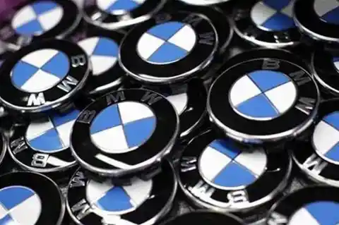
The colors are blue and white to represent the Bavarian Free State colors. The reason it looks how it does is because using a national symbol in a commercial trademark was illegal, so the colors were arranged in an opposing order. There you have it.
Ever notice how the Google logo has four primary colors in a row then it's broken by a secondary color? This was entirely intentional.

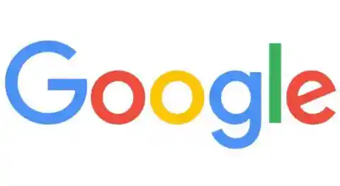
Google wanted to show that they don't play by the rules and are also playful without making the symbol bulky. To do that, they just used simple letters and colors.
Wendy's
If you look at Wendy's collar you'll actually see the word "MOM."

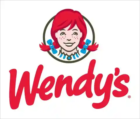
Their thinking is that the next time you think of mom's cooking, you'll think Wendy's.
Northwest Airlines
This logo actually has two hidden messages. First, it features an N and a W in negative spaces.
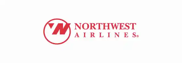
Second, the triangle in the circle points northwest as if it's a compass.
Coca Cola
Look closely at the "o." Do you notice anything? No? Don't worry because most people wouldn't notice it. It's actually the Denmark flag. This wasn't always the original intention.
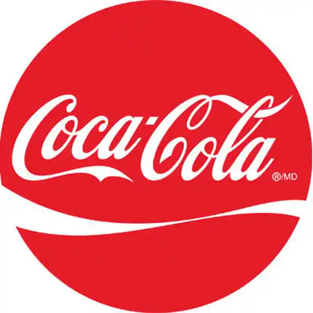

Coca Cola discovered that part of its logo looks like the Danish flag, which has been named the happiest country on earth. Once they discovered that, they set up a media stunt in Denmark's biggest airport, where they welcome people with flags.
Presbyterian Church
Religion is rife with symbolism, so would you be surprised to learn that the Presbyterian church logo has EIGHT hidden symbols in it?
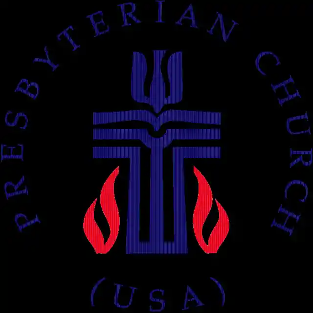
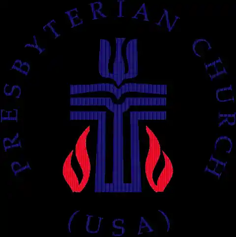
How many can you find?
VAIO

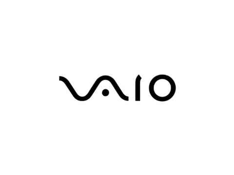
At first you just see the word VAIO, but look a little closer and you'll see the first two letters represent an analog symbol and the last two letters are binary.
LG
No, the Pac-Man reference is not confirmed, but it's cool to look at anyways. There is hidden meaning in the LG logo, though. Everyone knows the face, but its position, as well as the "L" and "G," inside the circle that matters.

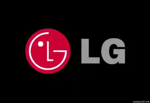
According to LG, this centers humanity above all else. The circle itself symbolizes the world, future, youth, humanity, and technology while the red represents friendliness. (Hint: a lot of companies use red for this very reason, as it seems to attract consumers a lot.)
Adidas
Ever notice that Adidas' symbol looks like a mountain? Well, that's exactly what it's supposed to mean. The three stripes, which was part of the original logo in 1967, never really meant anything.

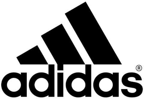
It was just supposed to be unique. In the '90s, though, they slanted the stripes so that it would represent a mountain, which stands for the obstacles people need to overcome.
Häagen-Dazs
This is actually one of the only things on this list without a hidden meaning, but I had to add it simply for the fact that it blew my mind when I found out. Ever wonder what Häagen-Dazs means? It means nothing.

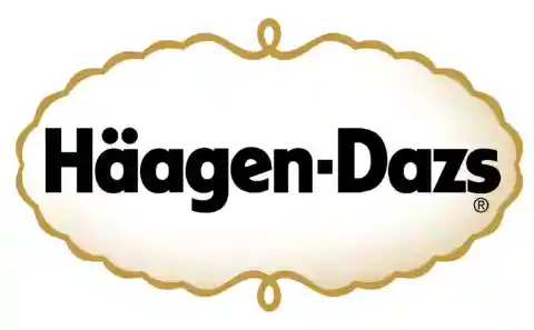
Creator Reuben Mattus invented the word to make it sound "Danish-sounding," essentially in homage. This takes their slogan, "made like no other," to a whole new level.
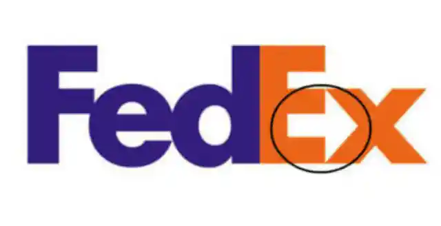
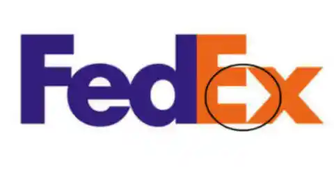
FedEx
The FedEx logo is a creative one!

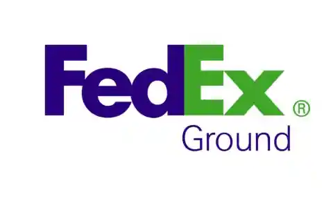
At first glance all you can really notice are the two different colors, but if you look closely you can see an arrow is created between the spaces of the letter 'E' and 'X', representing the company's forward-thinking ways and outlook towards the future.
NBC
Yeah, it's a peacock, but did you ever wonder why it has so many colors? That's because, during the '50s, NBC's owner was RCA and they had just begun to manufacture color televisions.
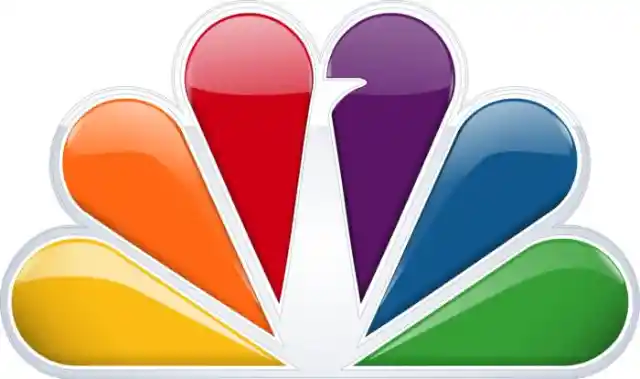

Since RCA wanted people still watching on black-and-white TV to know what they were missing, NBC created a colorful logo to adapt to the new technology.
Audi
Four hoops...plain and simple, right? Well, wrong.
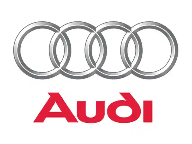
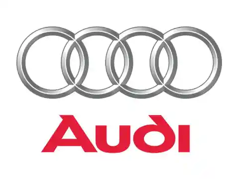
In fact, each of these hoops represent the 4 founding companies of the Auto-Union Consortium way back in 1932: like DKW, Horch, Wanderer and Audi.